Adopting Liquid Glass in a Production iOS App: A Practical Checklist
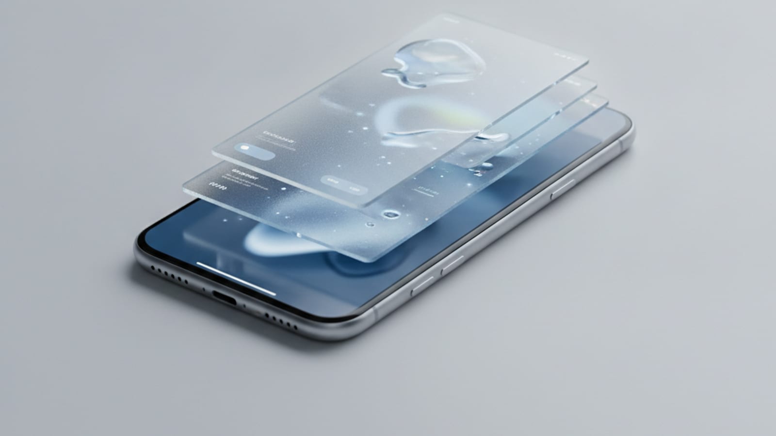
A shipping guide to Apple's Liquid Glass material: which SwiftUI APIs expose it, where it improves the experience and where it hurts legibility, the accessibility settings that disable it, and how to adopt it without breaking your existing design system.
Adopting Liquid Glass in a Production iOS App: A Practical Checklist
Our deep dive on Apple's Liquid Glass UI covered what the material is and why Apple shipped it. This piece is the follow-up people keep asking for: you have an app already in the store, it has a design system, and you need to decide what to actually do about it.
The short version — adopt the system components, be conservative with custom glass, and test with the accessibility settings turned on before you ship.
What you get for free
Recompile against the iOS 26 SDK and the standard components adopt the material automatically. Navigation bars, tab bars, toolbars, sheets, alerts, and system controls pick up the new look with no code change.
This is the single most important adoption decision, and it is a decision about what not to build. If your app uses standard chrome, most of the work is done. If your app has a hand-rolled tab bar because someone wanted a custom accent colour in 2021, you now own that divergence forever — and it will look increasingly out of place as the rest of the OS moves on.
Recommendation: before writing any Liquid Glass code, audit your custom chrome and delete what you can. Reverting to system components is usually the highest-value change you can make this release.
Applying the material yourself
For custom surfaces, SwiftUI exposes the material through a small set of modifiers:
// A custom floating control that should read as glass.
Button("Add Job") { … }
    .padding(.horizontal, 20)
    .padding(.vertical, 12)
    .glassEffect(.regular, in: .capsule)

// Interactive variant — responds to touch with the system's motion.
.glassEffect(.regular.interactive(), in: .rect(cornerRadius: 16))

// Group related glass elements so they blend and morph as one.
GlassEffectContainer(spacing: 12) {
    HStack(spacing: 12) {
        actionButton("Quote", systemImage: "doc.text")
        actionButton("Schedule", systemImage: "calendar")
    }
}
Two rules that matter more than the API surface:
Glass belongs to the control layer, not the content layer. The material is designed for things that float above content — toolbars, floating actions, overlays. Applying it to content itself (cards in a list, table rows, form backgrounds) produces exactly the muddy, low-contrast result Apple's guidelines warn about. If you take one thing from this article, take that.
Use GlassEffectContainer for adjacent glass elements. Individually applied effects sample the background independently and will not blend correctly when they sit next to each other or animate together.
Where Liquid Glass actively hurts
Be honest about your app's content. The material samples and refracts what is behind it, which means legibility depends entirely on the backdrop:
- Dense data tables and financial figures. A number that is hard to read is a support ticket. Use opaque surfaces.
- Long-form reading. Text over a refracting background is measurably slower to read.
- Anything over user-supplied imagery. You cannot control the backdrop, so you cannot guarantee contrast. Photo backgrounds are the classic failure case.
- Safety-critical or compliance UI. If a misread costs someone money or safety, opacity wins over aesthetics.
For our own field-service product the rule we settled on was simple: glass on the navigation and action layers, solid surfaces anywhere a tradie reads a price, a quantity, or a safety instruction.
The accessibility settings you must test
This is the part teams skip and then get reported for. Several system settings change or remove the material, and your layout has to hold up in every one:
| Setting | What happens | What to check |
|---|---|---|
| Reduce Transparency | Glass becomes largely opaque | Does your custom content still have adequate contrast against a solid fill? |
| Increase Contrast | Borders and separators strengthen | Do hand-drawn borders now double up? |
| Reduce Motion | The morphing and specular motion is dampened | Do transitions still communicate state change? |
| Dark Mode | The material tints differently | Are your foreground colours still legible against both tints? |
Test all four. Then test them on a device with a bright photo as the backdrop, which is the worst case for every one of them.
A useful discipline: never hard-code a foreground colour on top of glass. Use the semantic colours (.primary, .secondary) so the system can adapt them when the material changes underneath.
A staged adoption plan
Release 1 — recompile and audit. Build against the iOS 26 SDK, ship no new glass, and fix what the system components changed. Look specifically for custom chrome that now clashes, hard-coded bar heights, and safe-area assumptions that no longer hold. This release is about not regressing.
Release 2 — adopt system components. Replace custom navigation and tab bars with the standard ones. Delete code. This is where most of the visual benefit comes from.
Release 3 — selective custom glass. Apply glassEffect to genuinely floating controls only. Measure it — if your scroll performance drops on your oldest supported device, the material is not worth it there.
Do not try to do all three in one release. The first one is a maintenance release, and treating it as a redesign is how you ship a regression to every user at once.
Supporting older iOS versions
You will be supporting iOS 25 and earlier for a while. Gate the material behind availability checks and make the fallback deliberate rather than accidental:
extension View {
    @ViewBuilder
    func floatingSurface() -> some View {
        if #available(iOS 26.0, *) {
            self.glassEffect(.regular, in: .rect(cornerRadius: 16))
        } else {
            self.background(.regularMaterial, in: .rect(cornerRadius: 16))
        }
    }
}
One modifier, one decision point, applied everywhere. The alternative — availability checks scattered through your view code — is the thing you will still be paying for in two years.
We handle iOS 26 adoption as part of our app maintenance and support plans, and build native iOS products from Brisbane. If you want a review of what Liquid Glass means for your specific app, get in touch.